
yarnbarf
The yarnbarf mobile knitting/crochet pattern database allows users to find knitting patterns and save them for further viewing. This school project was inspired by comments from my knitting club that there was a lack of a good mobile applications for viewing knitting/crochet patterns.
This was an individual UX project, and I designed the mobile app over the course of 3 months. The objective of the project was to design an easy way for users to browse, sort, filter, view and save patterns for future viewing.
Project Deliverables
Research
Competitive Analysis
User Interviews
Survey
Persona
Design
Information Architecture
Low-Fidelity Wireframes (Adobe XD)
Analysis
Usability Testing
Prototyping
Branding
High-Fidelity Prototype (Adobe XD)
Research
To best understand my users, I conducted a competitive analysis as well as user survey for the knitting and crochet community.
Competitive Analysis
My competitive analysis looked at Ravelry, Ravit, Alpaca and Wooly. The key findings from my research are as follows:

User Research
I conducted secondary research on the knitting/crochet community by using the results of a survey conducted in 2016 by the Yarn and Craft Council. Although it gave me great insights into my user needs, I wanted to validate their findings and gather more information though my own user survey using Typeform. I received 17 responses that provided me with specific data on my users as well as what they need from an app in terms of information architecture. Key insights from my survey are as follows:

Persona
Product Goals
Browsing
Make finding patterns easy by streamlining the look of the app and providing important contextual information immediately.
Filtering
Make a streamlined filtering process to help narrow results without overwhelming users with information.
Saving content
Make a favourites feature that allows users to easily find patterns they want to view later
Information Architecture
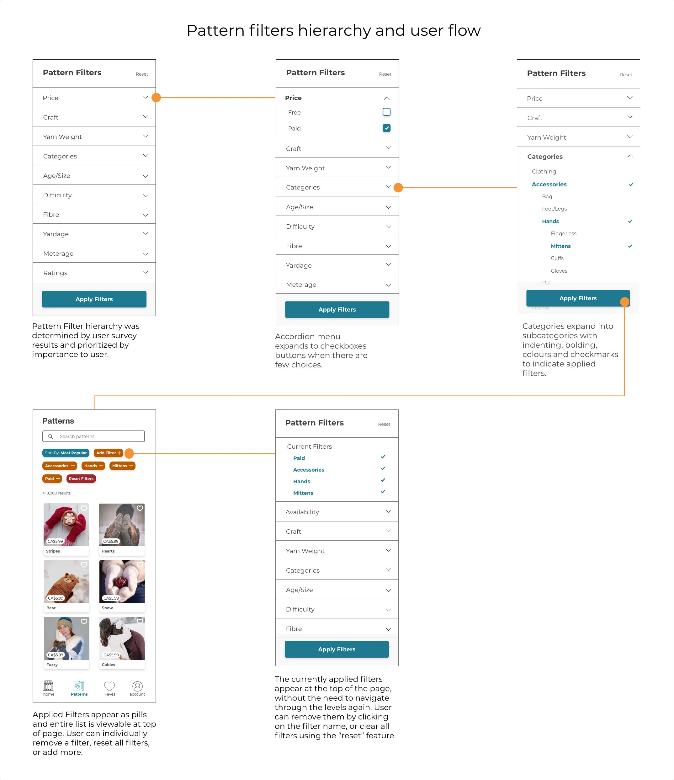
When determining my information architecture, it was clear from my competitive analysis that the apps' categories used industry-standard terminology. I did not want to confuse my users by adopting new terminology that would not fit their mental model. In my user survey I included ranked questions about the priority for filtering options. My research led me to develop the following hierarchy:
Low-Fidelity Wireframes
I completed my low-fidelity wireframes in Adobe XD, The focus for my initial design was to get the filtering, pattern page, sorting and favourites feature right.


Usability Testing
I conducted usability testing with three participants in a moderated remote test with 13 tasks that had users utilize the sort, filter and favourites features. Since this was a primarily information architecture project, the follow-up question were related to the filtering of content and how easy the app was to use in general. Key quotes from my testing are as follows:

High-Fidelity Prototype
I completed my high-fidelity mock-ups in Adobe XD and edited my photos that I sourced from Pexels and Unsplash in Adobe Photoshop. The only change made to the design post-usability testing was to change the label of “availability” to “price” in the filters.

This is the home page when the user opens the app. It has a simple, clean design with minimal use of colour.

The login page is very simple and uses text tips to assist the user in understanding the format they need to use for text input. There is a universal icon for viewing the password input.

Side swipe for categories & curated content. Clear information hierarchy for labeling. Bottom navigation, with bolded text and coloured icons to show where the user is in the app. Pattern search feature with a text tip.
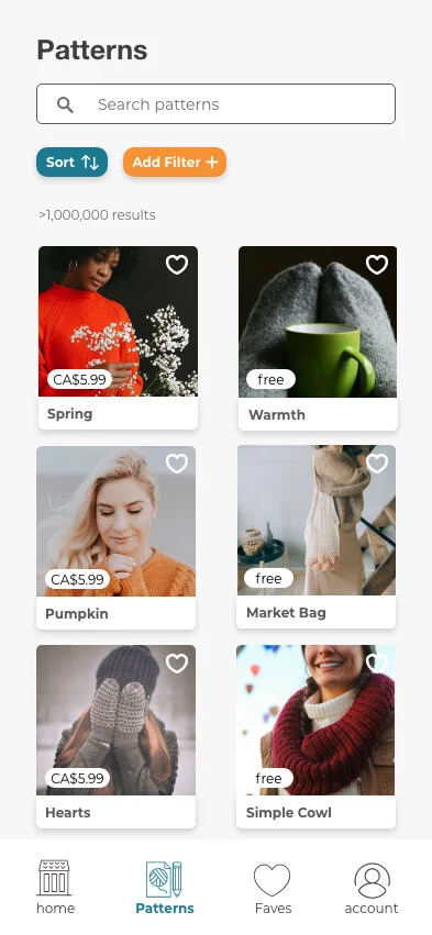
Sort and filtering options in pill format. Patterns are in a card format, and include price indicators. Heart on each card that can be double tapped to add something to their faves quickly.
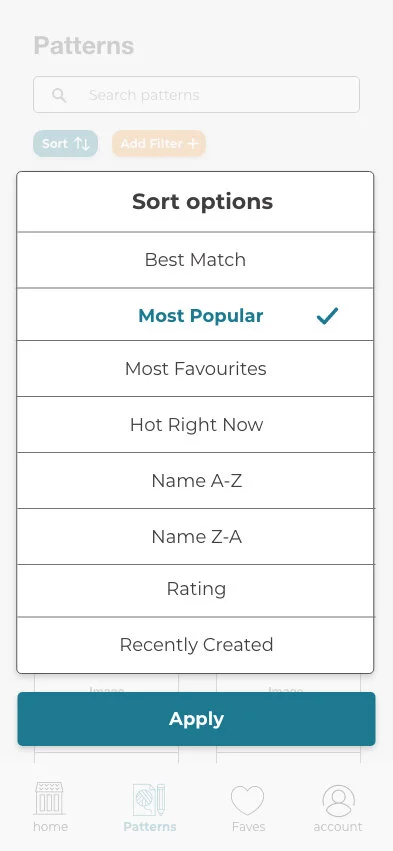
Sort options show in an overlay. The options included were universal and are listed in the same hierarchy as competitor apps. The font colour changes, the text becomes bold and there is a checkmark to indicate their selection. The user needs to apply the sort option to minimize user error.

The sort option appears as text in the pill to help the user remember what option they chose.

Filters in accordion format to as not to overwhelm the user. Users can always apply multiple filters when they are narrowing down the content. When there are only a few options, they are presented with checkboxes.

When a user filters on a category that has subcategories, the levels are displayed using tabbing and different font sizes. Bolding and checkmarks indicate which filters they have chosen. They can open and close the filter categories with the accordion arrow.

Filters that have been applied appear on the top of the page in a pill format. The label for the filter has a minus sign beside it, indicating that they can remove the filters one at a time. They can also fully reset the filters using the red pill button.

The hierarchy for the information presented in the pattern page was determined from the user survey. The information is broken up with lines and is easy to read. Users can tap on the heart in the right corner of the image to add the pattern to their faves.
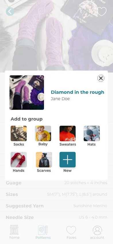
For easy content sorting, the faves feature is organized by groups. The users can select a group that they have already created, or create a new one.

Once a pattern has been added to their faves, a timed toast message appears to provide them with confirmation.

When a user goes to their faves they can see the groups they have created, as well as recently added items. Users specifically requested the ability to see their most recent patterns in the fave page to easily navigate to new patterns.
Conclusion
My research into different mobile applications to see how filters were designed was insightful. Filtering is a crucial function of any database and effective Information Architecture doesn't make you think. User preference is key when making successful information hierarchy.
I learned during the design process that it is tough to get people to do surveys and usability testing when you are limited to your own social network, and you have a short deadline. Ideally, I would have had more participants for both my research and testing, but it was not possible in the timeframe I was allowed. My usability testing identified that users would like to have additional features to differentiate it from Ravelry. If I had more time to make my design, I would build out the purchase feature, an online pattern viewer, and the app's complete account setting section.