Cannabis Canada

Cannabis Canada is a mail-order marijuana website that allows users to order cannabis online from anywhere in Canada for home delivery. Currently users are limited to provincial government websites to purchase cannabis products.
This website design was a class project that was completed in 3 months. My role in the project was UX and UI designer.
Product Deliverables
Research
User Research
Personas
Competitive Analysis
Design
Card Sort
Tree testing
Wireframes (Adobe XD)
Analysis
Usability Testing
Prototyping
High-Fidelity Prototype (Adobe XD)
Research
I conducted research into the competitive landscape, and interviewed six people who were cannabis users. The information that I gathered helped to develop my personas and come up with design goals.
Competitive Analysis
There were a lot of competitors in the Mail Order Marijuana market, both legal and illegal. As Cannabis Canada is looking to sell its products across Canada, I selected six provincial and territorial government cannabis sites. I looked at several factors that would later influence my design: the legal requirements for selling cannabis in different provinces, the visual and the information architecture used to organize the sites.
Key Findings
All of the websites had a landing page that required users to enter their age for legal purposes
Most of the websites use a minimalist design with very clean webpages and bold complementary colours
Most of the labelling on the websites were consistent and used common terminology
Nearly all of the websites had an educational section of the website to teach users about cannabis
A card format was used on nearly all of the websites to display the products
User Research
My user interviews were unstructured, but I gathered valuable data that helped me complete my design.
Key Findings
50% of participants had never purchased cannabis online before
75% of participants wanted rating for products based on previous purchases
100% of participants wanted information on the health effects and consumption of cannabis products
100% of users would like a way to save products for repurchase
Personas
Information Architecture
I made a few assumptions when developing my information architecture for the website based on the competitive analysis and user research. The labelling for my website matches the competitor's websites to reduce the cognitive load on users.
Card Sort
I proposed seven categories for my website and set up a hybrid card sort to test my assumptions. The card sorting activity yielded favourable results, with user agreement on 6/7 category labels.
Tree Test
I conducted a Tree Testing activity using my proposed labels and it was successful, as every participant was able to navigate to the sections of the site without any errors.
Site Map
A site map was created to organize the different levels of the website and can be seen below.

Low-Fidelity Wireframes
I began my design by creating a set of wireframes in Adobe XD to get the overall feel of the website before committing to a high-fidelity design. Each page on the website was made in low-fidelity and presented for critique. I had two UX Designers, two Product Owners, and two Developers from my network review my designs and offer revisions that helped me create my final prototype.


Usability Testing
I recruited ten participants for usability testing and conducted 4 design revisions based on their feedback.
Key Findings
Users loved the favourites feature
Users found it easy to navigate between pages
Users liked that the navigation was wide and shallow
Users identified that it would be difficult to find specific products with only filters and a global search should be included
High-Fidelity Mockups
My high-fidelity mock-ups were created using Adobe XD, with photos edited in Adobe Photoshop. Photos are sourced from Unsplash and Pexels, and icons from icons8 and flaticon.

The website is "locked" until an age confirmation is entered to meet legal requirements for cannabis websites. The design for the webpage is very simple and clean, with minimal use of colour.

The home page for the website includes featured content with category labels. and areas to learn more. The global navigation is at the top of the page, and there are labeled icons for cart, faves, search and account.

There is clear labeling and breadcrumbs to help the user identify where they are. Filters are clearly labeled with checkboxes.The products are in a card format with information that is relevant to the product. Users can add to their faves by clicking on the heart icon.
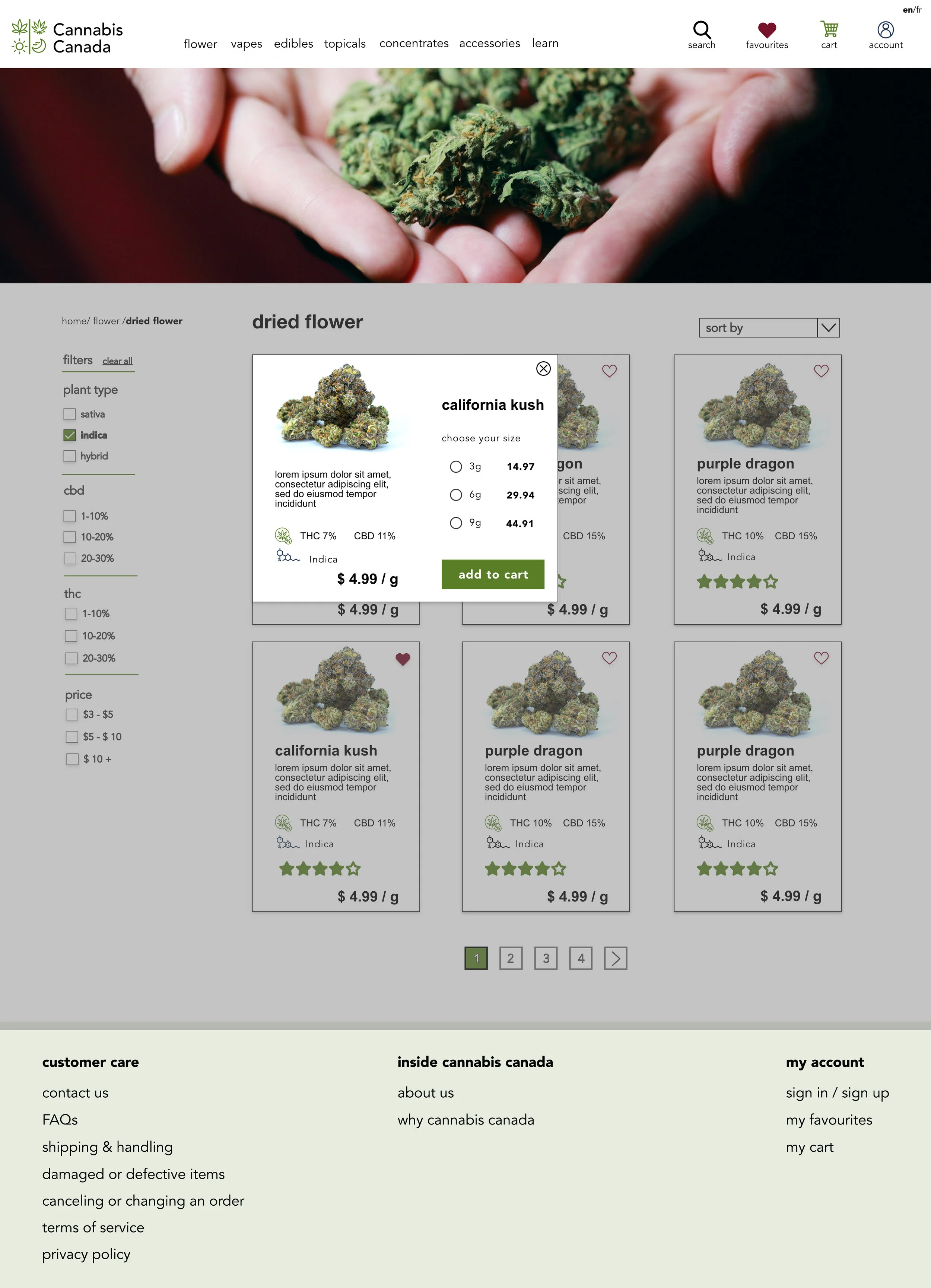
Clicking on a card will bring up an overlay for users. The options for the product amount are set based on packaging and use radio buttons.
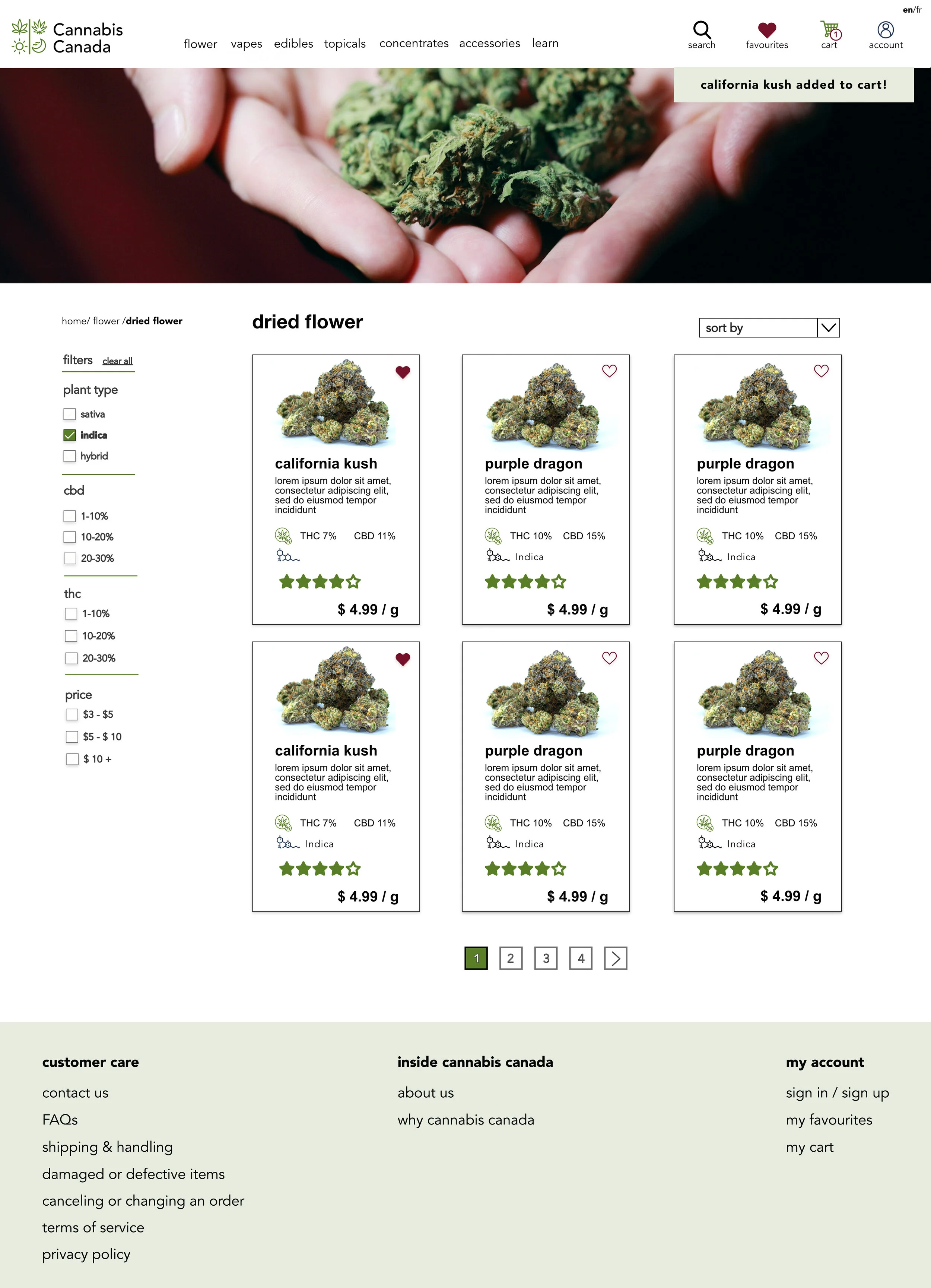
When a product is added to the cart, a timed toast message appears on the page to confirm their selection. The cart icon updates with how many items are in the bag.

The cart uses a simple format, with a combo-box for item amounts. The use of the box rather than a stepper is because there is a limit of how many grams can be purchased. It is easy for the user to add/remove items using the icons.

When content is selected from the use page it is broken down into expandable accordions to allow the user to view the content they want without overwhelming them with information.

The favourites page is nearly identical to the product page, to minimize cognitive load on the user.

The account page includes a sidebar navigation along with the cards with icons to allow users to find a page using their preferred method.
Conclusion
This project was my first UX/UI high-fidelity prototype, and I spent five weeks working on the project from start to finish. It was completed remotely due to the COVID-19 pandemic, which added a challenge to my design process. I did extensive research during this project that allowed me to understand the problem and my users. I sought the feedback of experienced professionals in my design phase that helped me learn what to expect for a design critique when working in a team that consists of UX designers, Product Owners and Developers.
The project was not without some bumps along the road, and I believe that it was a great learning experience.
Lessons Learned
Take recruitment more seriously and do formalized discovery interviews with specific questions rather than casual chats with users.
Better define my scope early on to avoid adding new features late in the process to prevent scope creep.
Leave enough time before the deadline to mock up all of my features as I was missing some interactions I wanted to include
Do more usability testing in the wireframing stage instead of the final design to avoid having to do so many changes late in the process.
Take advantage of XD tutorials when I struggled to use the tool instead of trying to figure everything out myself.